pacman::p_load(plotly, crosstalk, DT,
               ggdist, ggridges, colorspace,
gganimate, tidyverse)Hands-on Exercise 4.3
1 Visualising Uncertainty
1.1 Learning Outcome
Visualising uncertainty is relatively new in statistical graphics. In this chapter, you will gain hands-on experience on creating statistical graphics for visualising uncertainty. By the end of this chapter you will be able:
to plot statistics error bars by using ggplot2,
to plot interactive error bars by combining ggplot2, plotly and DT,
to create advanced by using ggdist, and
to create hypothetical outcome plots (HOPs) by using ungeviz package.
1.2 Getting Started
1.2.1 Installing and loading the packages
For the purpose of this exercise, the following R packages will be used, they are:
tidyverse, a family of R packages for data science process,
plotly for creating interactive plot,
gganimate for creating animation plot,
DT for displaying interactive html table,
crosstalk for for implementing cross-widget interactions (currently, linked brushing and filtering), and
ggdist for visualising distribution and uncertainty.
1.2.2 Data import
For the purpose of this exercise, Exam_data.csv will be used.
exam <- read_csv("data/Exam_data.csv")Rows: 322 Columns: 7
── Column specification ────────────────────────────────────────────────────────
Delimiter: ","
chr (4): ID, CLASS, GENDER, RACE
dbl (3): ENGLISH, MATHS, SCIENCE
ℹ Use `spec()` to retrieve the full column specification for this data.
ℹ Specify the column types or set `show_col_types = FALSE` to quiet this message.1.3 Visualizing the uncertainty of point estimates: ggplot2 methods
A point estimate is a single number, such as a mean. Uncertainty, on the other hand, is expressed as standard error, confidence interval, or credible interval.
Important
- Don’t confuse the uncertainty of a point estimate with the variation in the sample
In this section, you will learn how to plot error bars of maths scores by race by using data provided in exam tibble data frame.
Firstly, code chunk below will be used to derive the necessary summary statistics.
my_sum <- exam %>% group_by(RACE) %>% summarise( n=n(), mean=mean(MATHS), sd=sd(MATHS) ) %>% mutate(se=sd/sqrt(n-1))
Tip
group_by()of dplyr package is used to group the observation by RACE,summarise()is used to compute the count of observations, mean, standard deviationmutate()is used to derive standard error of Maths by RACE, andthe output is save as a tibble data table called my_sum.
Note that there are five types of callouts, including: note, warning, important, tip, and caution.
Note
For the mathematical explanation, please refer to Slide 20 of Lesson 4.
Next, the code chunk below will be used to display my_sum tibble data frame in an html table format.
knitr::kable(head(my_sum), format = 'html')| RACE | n | mean | sd | se |
|---|---|---|---|---|
| Chinese | 193 | 76.50777 | 15.69040 | 1.132357 |
| Indian | 12 | 60.66667 | 23.35237 | 7.041005 |
| Malay | 108 | 57.44444 | 21.13478 | 2.043177 |
| Others | 9 | 69.66667 | 10.72381 | 3.791438 |
1.3.1 Plotting standard error bars of point estimates
Now we are ready to plot the standard error bars of mean maths score by race as shown below.
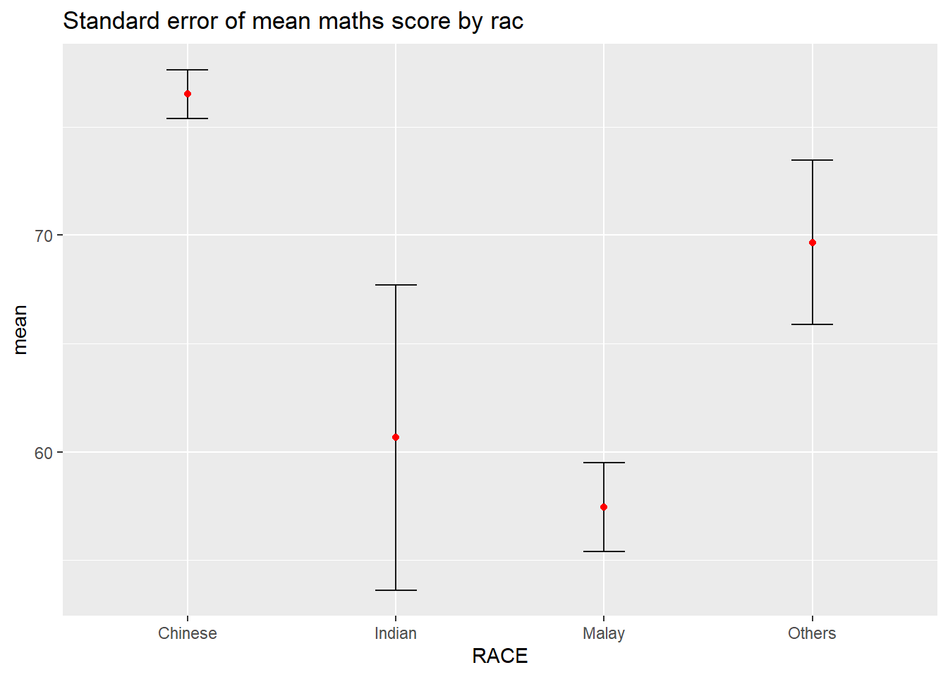
ggplot(my_sum) +
  geom_errorbar(
    aes(x=RACE,
        ymin=mean-se,
        ymax=mean+se),
    width=0.2,
    colour="black",
    alpha=0.9,
    linewidth=0.5) +
  geom_point(aes
           (x=RACE,
            y=mean),
           stat="identity",
           color="red",
           size = 1.5,
           alpha=1) +
  ggtitle("Standard error of mean maths score by rac")
Things to learn from the code chunk above
The error bars are computed by using the formula mean+/-se.
For
geom_point(), it is important to indicate stat=“identity”.
1.3.2 Plotting confidence interval of point estimates
Instead of plotting the standard error bar of point estimates, we can also plot the confidence intervals of mean maths score by race.
ggplot(my_sum) +
  geom_errorbar(
    aes(x=reorder(RACE, -mean),
        ymin=mean-1.96*se,
        ymax=mean+1.96*se),
    width=0.2,
    colour="black",
    alpha=0.9,
    linewidth=0.5) +
  geom_point(aes
           (x=RACE,
            y=mean),
           stat="identity",
           color="red",
           size = 1.5,
           alpha=1) +
  labs(x = "Maths score",
       title = "95% confidence interval of mean maths score by race")
Things to learn from the code chunk above
The confidence intervals are computed by using the formula mean+/-1.96*se.
The error bars is sorted by using the average maths scores.
labs()argument of ggplot2 is used to change the x-axis label.
1.3.3 Visualizing the uncertainty of point estimates with interactive error bars
In this section, you will learn how to plot interactive error bars for the 99% confidence interval of mean maths score by race as shown in the figure below.
Warning: Using `size` aesthetic for lines was deprecated in ggplot2 3.4.0.
ℹ Please use `linewidth` instead.
Warning in geom_point(aes(x = RACE, y = mean, text = paste("Race:", RACE, :
Ignoring unknown aesthetics: textshared_df = SharedData$new(my_sum)
bscols(widths = c(4,8),
ggplotly((ggplot(shared_df) +
geom_errorbar(aes(
x=reorder(RACE, -mean),
ymin=mean-2.58*se,
ymax=mean+2.58*se),
width=0.2,
colour="black",
alpha=0.9,
size=0.5) +
geom_point(aes(
x=RACE,
y=mean,
text = paste("Race:", `RACE`,
"<br>N:", `n`,
"<br>Avg. Scores:", round(mean, digits = 2),
"<br>95% CI:[",
round((mean-2.58*se), digits = 2), ",",
round((mean+2.58*se), digits = 2),"]")),
stat="identity",
color="red",
size = 1.5,
alpha=1) +
xlab("Race") +
ylab("Average Scores") +
theme_minimal() +
theme(axis.text.x = element_text(
angle = 45, vjust = 0.5, hjust=1)) +
ggtitle("99% Confidence interval of average /<br>maths scores by race")),
tooltip = "text"),
DT::datatable(shared_df,
rownames = FALSE,
class="compact",
width="100%",
options = list(pageLength = 10,
scrollX=T),
colnames = c("No. of pupils",
"Avg Scores",
"Std Dev",
"Std Error")) %>%
formatRound(columns=c('mean', 'sd', 'se'),
digits=2))1.4 Visualising Uncertainty: ggdist package
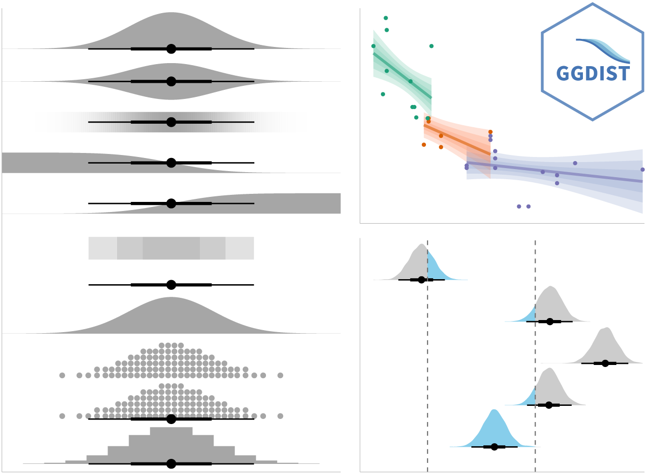
ggdist is an R package that provides a flexible set of ggplot2 geoms and stats designed especially for visualising distributions and uncertainty.
It is designed for both frequentist and Bayesian uncertainty visualization, taking the view that uncertainty visualization can be unified through the perspective of distribution visualization:
for frequentist models, one visualises confidence distributions or bootstrap distributions (see vignette(“freq-uncertainty-vis”));
for Bayesian models, one visualises probability distributions (see the tidybayes package, which builds on top of ggdist).
1.4.1 Visualizing the uncertainty of point estimates: ggdist methods
In the code chunk below, stat_pointinterval() of ggdist is used to build a visual for displaying distribution of maths scores by race.
exam %>%
  ggplot(aes(x = RACE,
             y = MATHS)) +
  stat_pointinterval() +
  labs(
    title = "Visualising confidence intervals of mean math score",
    subtitle = "Mean Point + Multiple-interval plot")
Note
This function comes with many arguments, students are advised to read the syntax reference for more detail.
For example, in the code chunk below the following arguments are used:
.width = 0.95
.point = median
.interval = qi
exam %>%
  ggplot(aes(x = RACE, y = MATHS)) +
  stat_pointinterval(.width = 0.95,
  .point = median,
  .interval = qi) +
  labs(
    title = "Visualising confidence intervals of median math score",
    subtitle = "Median Point + Multiple-interval plot")
Warning in layer_slabinterval(data = data, mapping = mapping, stat =
StatPointinterval, : Ignoring unknown parameters: `.point` and `.interval`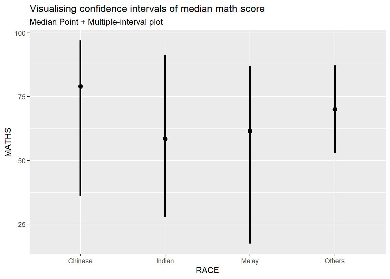
1.4.2 Visualizing the uncertainty of point estimates: ggdist methods
exam %>%
  ggplot(aes(x = RACE,
             y = MATHS)) +
  stat_pointinterval(
    show.legend = FALSE) +
  labs(
    title = "Visualising confidence intervals of mean math score",
    subtitle = "Mean Point + Multiple-interval plot")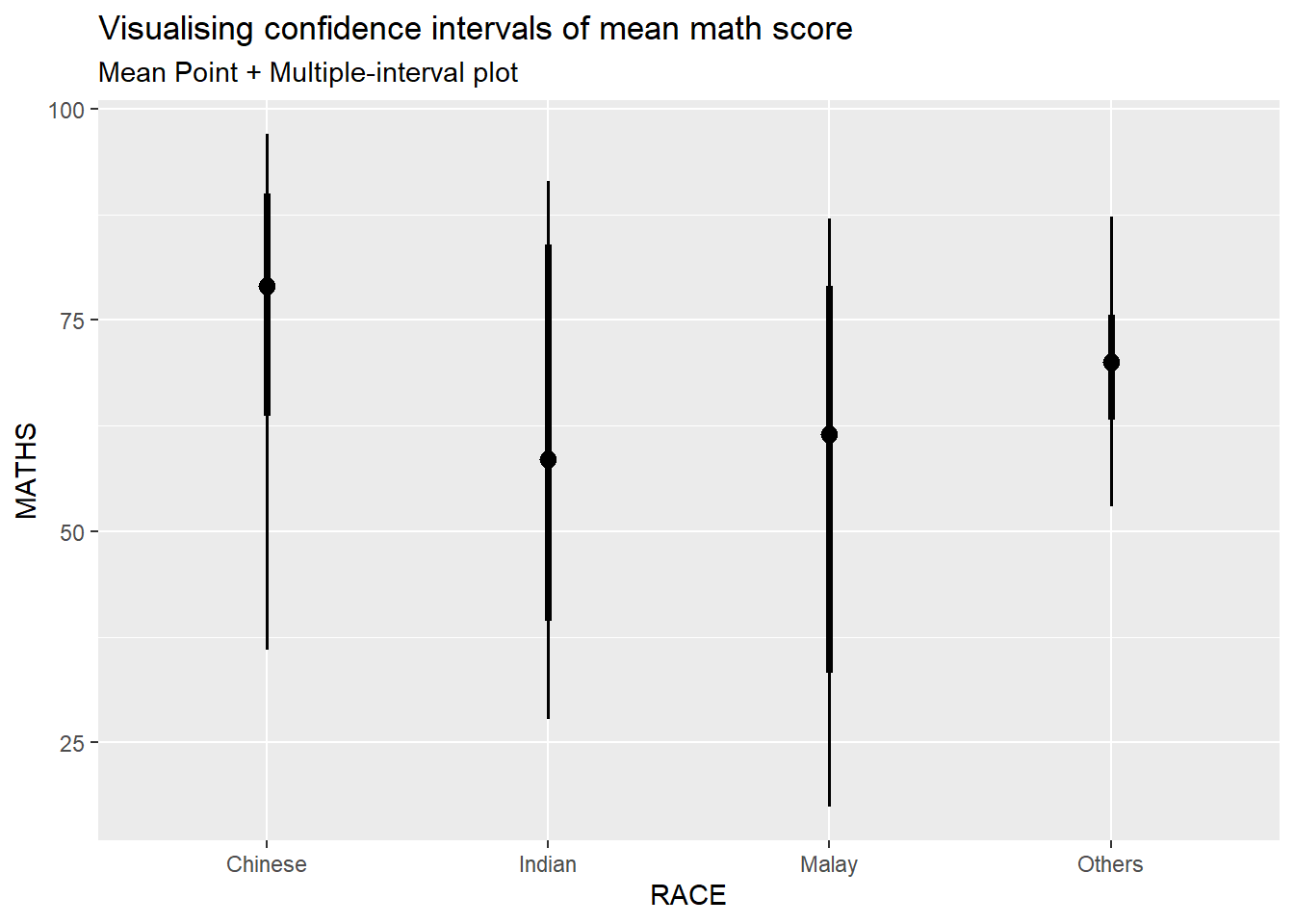
Gentle advice: This function comes with many arguments, students are advised to read the syntax reference for more detail.
1.4.3 Visualizing the uncertainty of point estimates: ggdist methods
In the code chunk below, stat_gradientinterval() of ggdist is used to build a visual for displaying distribution of maths scores by race.
exam %>%
  ggplot(aes(x = RACE,
             y = MATHS)) +
  stat_gradientinterval(
    fill = "skyblue",
    show.legend = TRUE
  ) +
  labs(
    title = "Visualising confidence intervals of mean math score",
    subtitle = "Gradient + interval plot")
Warning in draw_slabs(self, ...): `fill_type = "gradient"` is not supported by the current graphics device.
ℹ Falling back to `fill_type = "segments"`.
→ If you believe your current graphics device does support `fill_type =
"gradient"` but auto-detection failed, try setting `fill_type = "gradient"`
explicitly. If this causes the gradient to display correctly, then this
warning is likely a false positive caused by the graphics device failing to
properly report its support for the `"LinearGradient"` pattern via
`grDevices::dev.capabilities()`. Consider reporting a bug to the author of
the graphics device.
ℹ For more information, see the documentation for `fill_type` in
`ggdist::geom_slabinterval()` or the documentation for
`ggplot2::check_device()`.
Caused by warning in `draw_slabs()`:
! Unable to check the capabilities of the png device.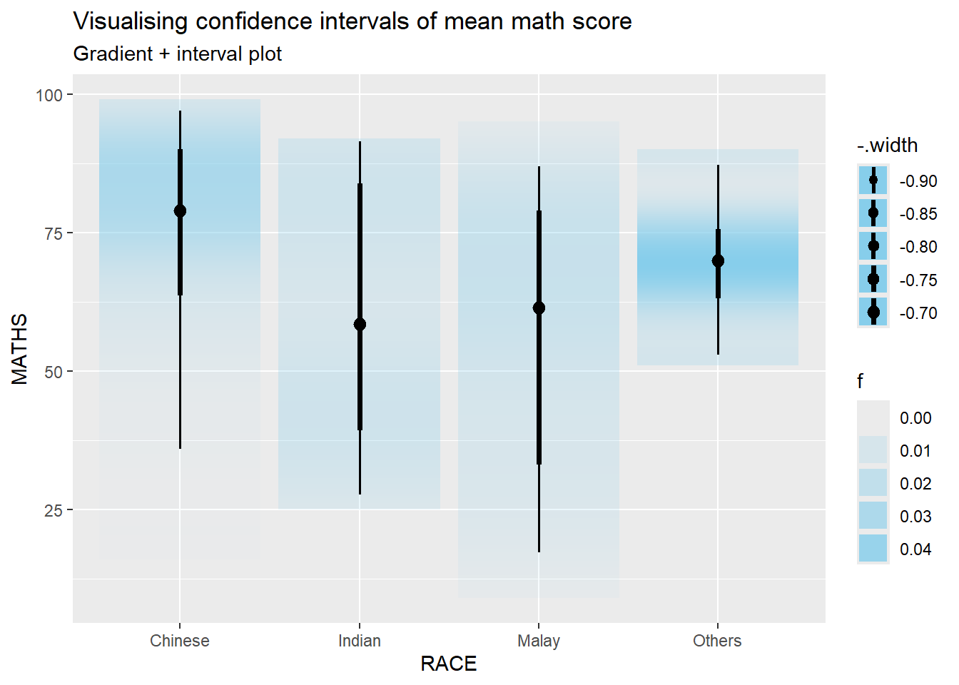
Gentle advice: This function comes with many arguments, students are advised to read the syntax reference for more detail.
1.5 Visualising Uncertainty with Hypothetical Outcome Plots (HOPs)
1.5.1 Installing ungeviz package
devtools::install_github("wilkelab/ungeviz")WARNING: Rtools is required to build R packages, but no version of Rtools compatible with R 4.5.0 was found. (Only the following incompatible version(s) of Rtools were found: 4.3.5958, 4.4.6104)
Please download and install Rtools 4.5 from https://cran.r-project.org/bin/windows/Rtools/.Using GitHub PAT from the git credential store.Downloading GitHub repo wilkelab/ungeviz@HEADstrapgod (NA -> ea2b1ecfc...) [GitHub]
cli (3.6.4 -> 3.6.5 ) [CRAN]
utf8 (1.2.4 -> 1.2.5 ) [CRAN]
scales (1.3.0 -> 1.4.0 ) [CRAN]Downloading GitHub repo DavisVaughan/strapgod@HEADcli (3.6.4 -> 3.6.5) [CRAN]
utf8 (1.2.4 -> 1.2.5) [CRAN]Installing 2 packages: cli, utf8Installing packages into 'C:/Users/gniyu/AppData/Local/R/win-library/4.5'
(as 'lib' is unspecified)package 'cli' successfully unpacked and MD5 sums checkedWarning: cannot remove prior installation of package 'cli'Warning in file.copy(savedcopy, lib, recursive = TRUE): problem copying
C:\Users\gniyu\AppData\Local\R\win-library\4.5\00LOCK\cli\libs\x64\cli.dll to
C:\Users\gniyu\AppData\Local\R\win-library\4.5\cli\libs\x64\cli.dll: Permission
deniedWarning: restored 'cli'package 'utf8' successfully unpacked and MD5 sums checked
The downloaded binary packages are in
C:\Users\gniyu\AppData\Local\Temp\RtmpgzriDW\downloaded_packages
── R CMD build ─────────────────────────────────────────────────────────────────WARNING: Rtools is required to build R packages, but no version of Rtools compatible with R 4.5.0 was found. (Only the following incompatible version(s) of Rtools were found: 4.3.5958, 4.4.6104)
Please download and install Rtools 4.5 from https://cran.r-project.org/bin/windows/Rtools/.* checking for file 'C:\Users\gniyu\AppData\Local\Temp\RtmpgzriDW\remotesa6824285a68\DavisVaughan-strapgod-ea2b1ec/DESCRIPTION' ... OK
* preparing 'strapgod':
* checking DESCRIPTION meta-information ... OK
* checking for LF line-endings in source and make files and shell scripts
* checking for empty or unneeded directories
Omitted 'LazyData' from DESCRIPTION
* building 'strapgod_0.0.4.9000.tar.gz'
Installing package into 'C:/Users/gniyu/AppData/Local/R/win-library/4.5'
(as 'lib' is unspecified)
Installing 3 packages: cli, utf8, scalesInstalling packages into 'C:/Users/gniyu/AppData/Local/R/win-library/4.5'
(as 'lib' is unspecified)package 'cli' successfully unpacked and MD5 sums checkedWarning: cannot remove prior installation of package 'cli'Warning in file.copy(savedcopy, lib, recursive = TRUE): problem copying
C:\Users\gniyu\AppData\Local\R\win-library\4.5\00LOCK\cli\libs\x64\cli.dll to
C:\Users\gniyu\AppData\Local\R\win-library\4.5\cli\libs\x64\cli.dll: Permission
deniedWarning: restored 'cli'package 'utf8' successfully unpacked and MD5 sums checked
package 'scales' successfully unpacked and MD5 sums checked
The downloaded binary packages are in
C:\Users\gniyu\AppData\Local\Temp\RtmpgzriDW\downloaded_packagesSkipping install of 'strapgod' from a github remote, the SHA1 (ea2b1ecf) has not changed since last install.
Use `force = TRUE` to force installation── R CMD build ─────────────────────────────────────────────────────────────────WARNING: Rtools is required to build R packages, but no version of Rtools compatible with R 4.5.0 was found. (Only the following incompatible version(s) of Rtools were found: 4.3.5958, 4.4.6104)
Please download and install Rtools 4.5 from https://cran.r-project.org/bin/windows/Rtools/.* checking for file 'C:\Users\gniyu\AppData\Local\Temp\RtmpgzriDW\remotesa68465557f9\wilkelab-ungeviz-74e1651/DESCRIPTION' ... OK
* preparing 'ungeviz':
* checking DESCRIPTION meta-information ... OK
* checking for LF line-endings in source and make files and shell scripts
* checking for empty or unneeded directories
* building 'ungeviz_0.1.0.tar.gz'
Installing package into 'C:/Users/gniyu/AppData/Local/R/win-library/4.5'
(as 'lib' is unspecified)
Note: You only need to perform this step once.
1.5.2 Launch the application in R
library(ungeviz)1.5.3 Visualising Uncertainty with Hypothetical Outcome Plots (HOPs)
Next, the code chunk below will be used to build the HOPs.
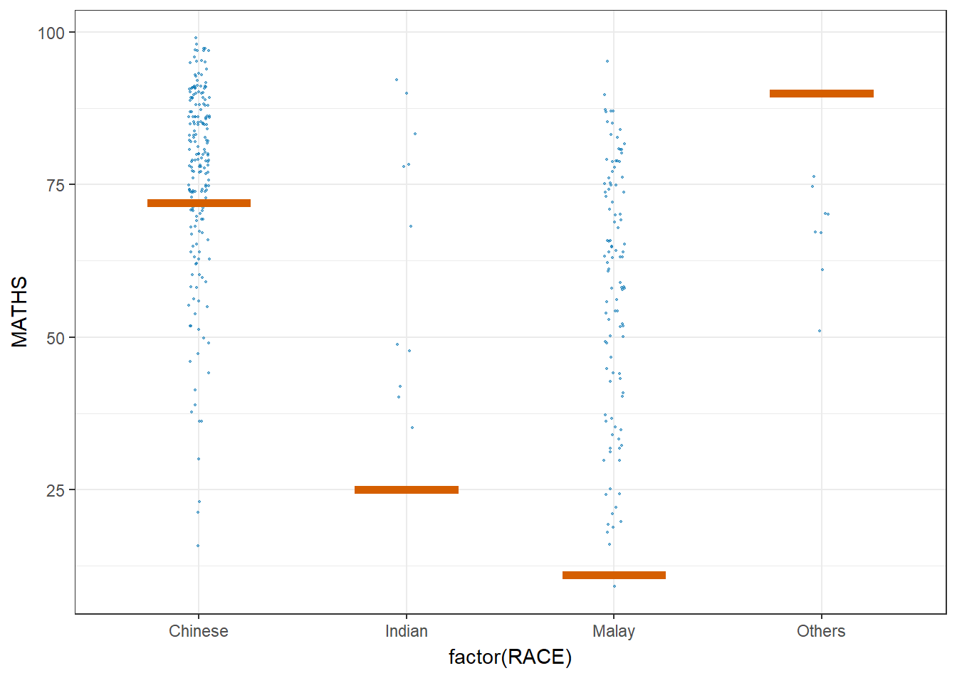
ggplot(data = exam,
       (aes(x = factor(RACE),
            y = MATHS))) +
  geom_point(position = position_jitter(
    height = 0.3,
    width = 0.05),
    size = 0.4,
    color = "#0072B2",
    alpha = 1/2) +
  geom_hpline(data = sampler(25,
                             group = RACE),
              height = 0.6,
              color = "#D55E00") +
  theme_bw() +
  transition_states(.draw, 1, 3)
Warning in geom_hpline(data = sampler(25, group = RACE), height = 0.6, color =
"#D55E00"): Ignoring unknown parameters: `height`